
The Pantone Color Of The Year
- Industry News
- Search Engine Optimization
- Web Design
 Dec 10, 2014
Color has always been an integral part of how a culture expresses the attitudes and emotions unique to its times. From the psychedelic colors that represented the 1960’s, to the earthy tones that robed the kings of disco in the 1970’s.
What colors will define our generation? Now Pantone has the answer.
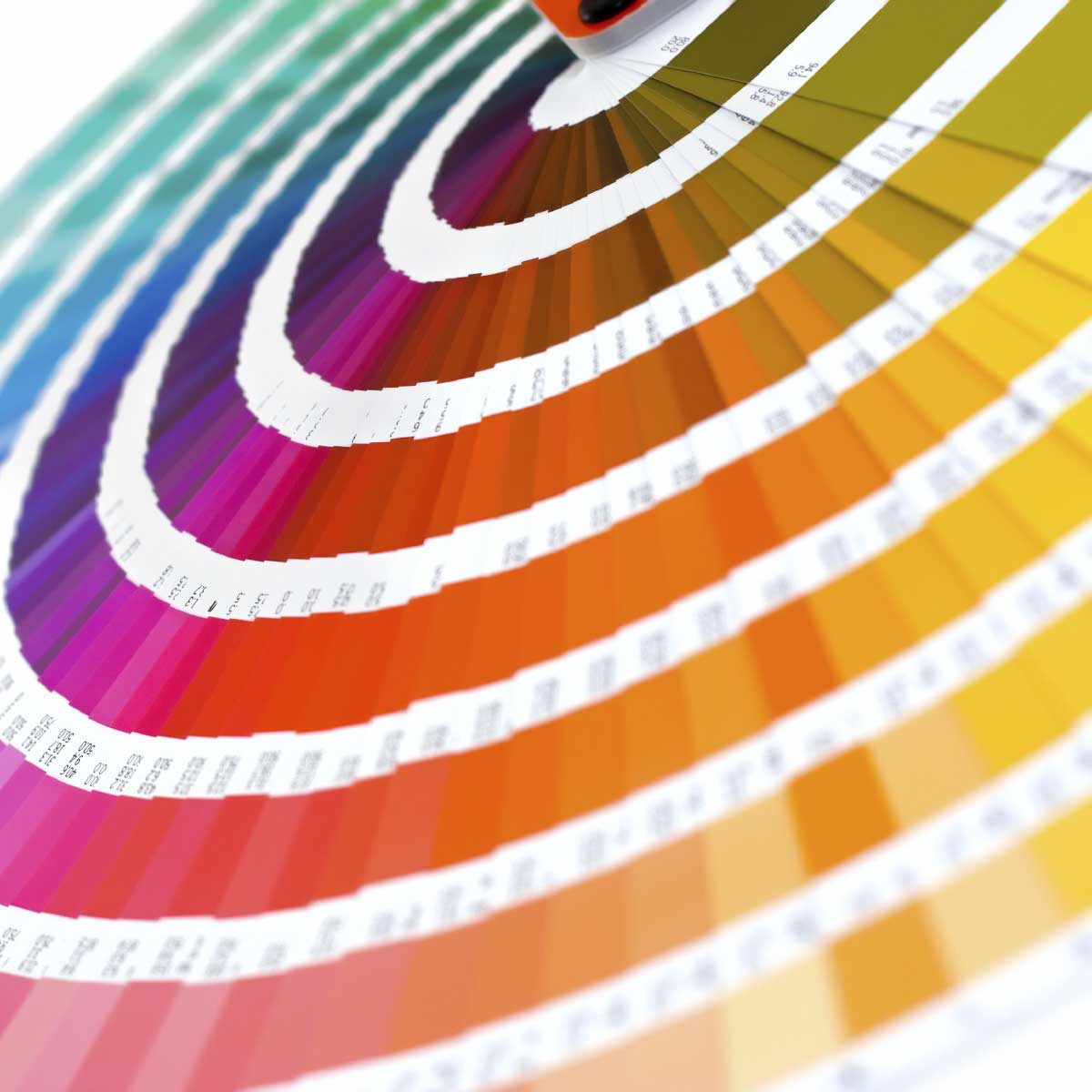
Pantone Color Matching System
Pantone began as a color print media printer, hiring a chemist named Lawrence Herbet who helped develop the Pantone Color Matching System. This standardized color reproduction using a gradient of swatches that can be matched regardless of the printing machine used. By standardizing the colors, different manufacturers in different locations can all refer to the Pantone system to make sure colors match without direct contact with one another.
So, what Pantone does is create color matching systems. But what they’re known for among the wider public is the Color of Year.
Secret Meeting
Twice a year the company hosts a secret meeting over two days in a European capital, with representatives from around the world, to determine a particular Color of the Year. They debate the advantages of different contenders and eventually pick their winner.
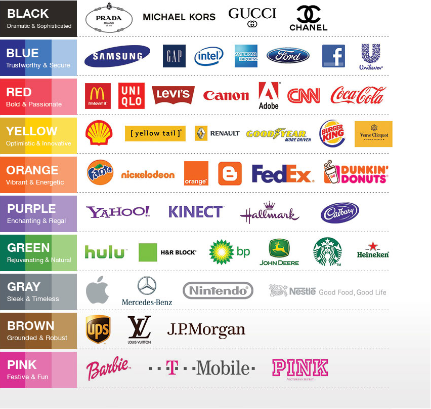
The results from this meeting will guide fashion designers, florists, and many other consumer driven companies to plan for future products. Here you can see how color influences all the major brands.
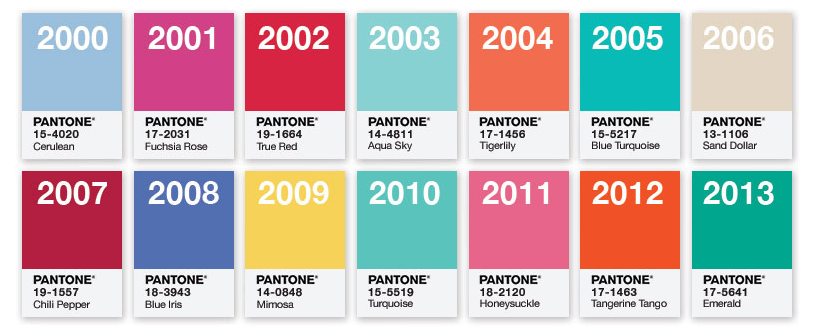
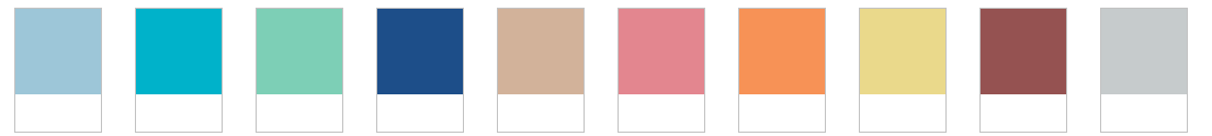
Below are the last 14 Pantone colors chosen at those meetings.
The 2015 Color of the Year
Don’t call it brown.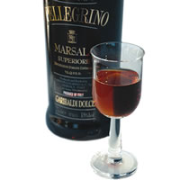
Pantone has named Marsala the 2015 color of the year.
It’s more like an earthy wine. Marsala is actually a port in Sicily, and has given its name to the wine produced there; now it’s popularly fortified with extra alcohol.
How did this decision happen? A group of professionals in different fields – ranging from psychology to fashion design, look at world trends in color.
Because they’re always thinking about what colors they see, they have a sense about what colors are resonating with people across the world – from New York, Paris and Milan to Dubai. Their sources aren’t simply fashion shows. The pigment of an acclaimed gallery exhibit, or the shirt color of a television anchor can help influence their understanding of the colors people care about.
These experts have now predicted a shift towards using less intense colors, mirroring the desire of a hugely connected humanity to pull the plug, take it easy and vacate from a bold and frenetic life.
Leatrice Eiseman, the Executive Director of Pantone Color Institute, described the committee’s decision for choosing Marsala:
“This season there is a move toward the cooler and softer side of the color spectrum. An eclectic, ethereal mix of understated brights, pale pastels and nature-like neutrals take center stage as designers draw from daydreams of simpler times. Remembrances of retro delights, folkloric and floral art, and the magical worlds of tropical landscapes restore a sense of well-being as we head into warmer months.”
2015 Fashion Color Palate
Below is the 2015 fashion color palate called: En Plein Air. This French expression translates as “in the open air,” and refers to painting outside. It’s a fine theme to tie together the muted, environmental tones of the more neutral color palate, and the desire to break away from the workaday pack.
Spring 2014 Color
The spring 2014 Pantone color of the year was radiant orchid. The committee felt that consumers should take heart in a spring-like hue to thrive in the winter months. Radiant Orchid is a versatile shade that can be worn by both men and women. Numerous celebrities embrace this color palate and incorporated this hue into their wardrobes.
Color and Us
Yes, it’s cheeky to declare the world’s color.
But we must admit that these Pantone color pundits are some of the few people thinking about what colors we use, and what those colors say about our lives.
Last year, we were radiant orchids.
This year, we’re wine with added alcohol.
Ready to Dominate Online and Grow Your Business?
Schedule time to connect with Blueprint about your online goals, or request a free review of marketing campaigns.
Related Posts
Creating Better and Faster Landing Pages with AI

What Makes a Great Website Design for Healthcare Providers?

What Your Website Communicates Before Anyone Reads A Word

Partner with BLUEPRINT to reach your online goals, grow your business and reshape your story.
Get in touch with BLUEPRINT
Reach out to request a discovery call, a free campaign review, or for all other inquiries.