Handy CSS Tips for Responsive Design
Responsive design seems to be everywhere these days. I previously shared some responsive design tricks as well as some other useful tips on responsive design. Today, I am going to offer some more CSS tips that will be especially handy for responsive web development.
CSS Media Queries for Retina Displays
Retina displays have a higher pixel ratio than regular screens. Therefore, images might not look too great on a mobile device. To deal with this problem, there are media queries for retina displays.
One of the joys of being a front-end web developer is dealing with browser compatibility issues. To deal with the different browsers available for the mobile platform, there are vendor prefixes for the retina display media query:
-webkit-min-device-pixel-ratio
min--moz-device-pixel-ratio
-o-min-device-pixel-ratio
In the actual CSS, the media queries will probably look something like this:
@media only screen and (-moz-min-device-pixel-ratio: 1.5),
only screen and (-o-min-device-pixel-ratio: 3/2),
only screen and (-webkit-min-device-pixel-ratio: 1.5),
only screen and (min-device-pixel-ratio: 1.5),
only screen and (min-resolution: 144dpi) {
    .foo {
         background-image:url(images/bar.png);
     }
}
CSS Gradients
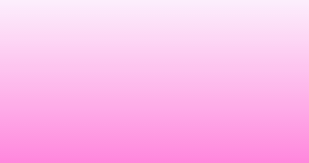
To provide a faster loading time on a mobile device and to avoid issues with different displays, it is probably better to use CSS3 gradients instead of making images out of gradients in Photoshop. However, the thing about CSS3 gradients is that the code can easily become too long if it is repeated. Therefore, it is useful to make one CSS class for a repeatedly-used gradient style. For example, you could have something like this:
.pink {
     background: #fcecfc;
     background: -moz-linear-gradient(top,  #fcecfc 0%, #ff7cd8 100%);
     background: -webkit-gradient(linear, left top, left bottom,
color-stop(0%,#fcecfc), color-stop(100%,#ff7cd8));
     background: -webkit-linear-gradient(top,  #fcecfc 0%,#ff7cd8 100%);
     background: -o-linear-gradient(top,  #fcecfc 0%,#ff7cd8 100%);
     background: -ms-linear-gradient(top,  #fcecfc 0%,#ff7cd8 100%);
     background: linear-gradient(to bottom,  #fcecfc 0%,#ff7cd8 100%);
}
The CSS code above will generate something like this below, and you can use the .pink class everywhere you want the pink gradient to appear:
Using one class to apply to similar elements doesn’t only have to apply to gradients. This kind of solution seems simple, but when there are deadlines to meet, sometimes it can be hard to keep code clean and there may be duplicate code. Remembering that classes can be reused will be really handy.
Conclusion
I hope this article was helpful! What other CSS tips do you find useful? Leave a comment below.