
 Share
Share As a web developer at Blueprint, my job is to turn beautiful designs into usable websites. One of the things I have been focusing on recently is mobile development, specifically responsive design.
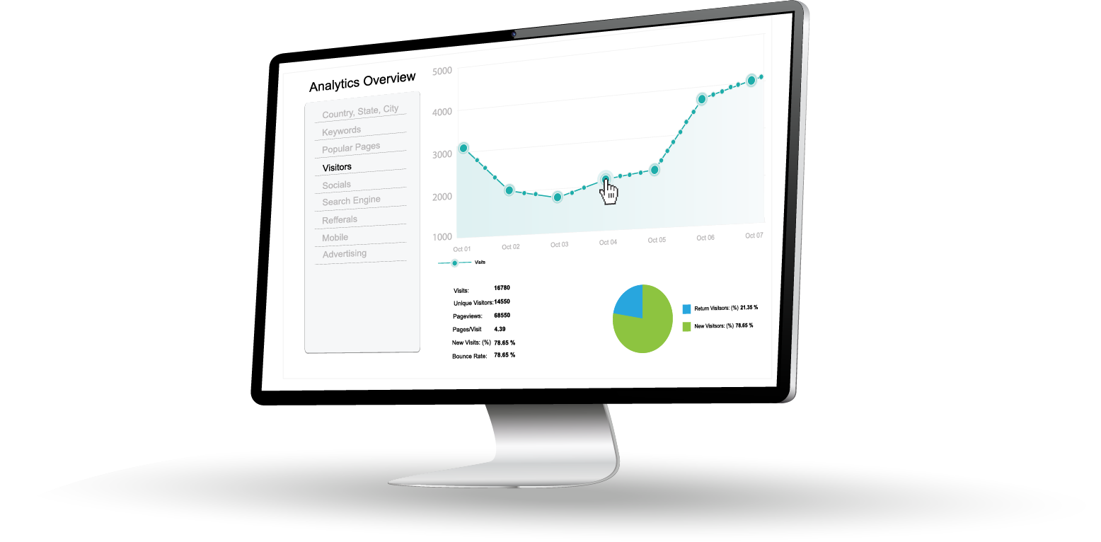
What is Responsive Design?
Responsive design fits its name: it responds to different web environments. With the emergence of smartphones and tablets, it is becoming challenging for web developers to cater to every single platform. There are the iPhones; Android Phone like HTC One, Samsung Galaxy, etc.; and tablets like iPad, iPad mini, Google Nexus, etc. The list goes on and on. With responsive design, web developers do not have to worry about different platforms as much since the website will adapt to different screen sizes.
Getting Started
My personal approach is to use media queries to make a website responsive. Below would be what a standard CSS link element might look like in the head.
<link rel="stylesheet" type="text/css" media="screen" href="style.css" />
You could include a stylesheet that will be shown for a different viewport. In the case below, if the device’s viewport is smaller than 600px, mobile.css will be applied.
<link rel="stylesheet" type="text/css"
media="screen and (max-device-width: 600px)" href="mobile.css" />
Example of Responsive Design
One website I have personally been working on at Blueprint is S&R Finishing. The website has just one breaking point at 600px. That means if a device has a viewport of 600px or smaller, the mobile version of the website will be shown.
Conclusion
This post only scratches the surface on responsive design. There are many factors to consider when working on a responsive design project such as how to handle CSS font sizes and making phone numbers work on a mobile device. However, responsive design is very relevant in today’s web development, and it would be useful to implement it on websites to improve user experience on mobile devices.
Ready to Dominate Online and Grow Your Business?
Schedule time to connect with Blueprint about your online goals, or request a free review of marketing campaigns.
Related Posts
What Makes a Great Website Design for Healthcare Providers?

What Your Website Communicates Before Anyone Reads A Word

Is Lead Generation Worth It for B2B Companies?

Partner with BLUEPRINT to reach your online goals, grow your business and reshape your story.
Get in touch with BLUEPRINT
Reach out to request a discovery call, a free campaign review, or for all other inquiries.