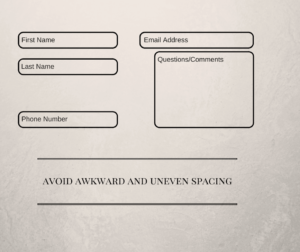
Forms are an important part of any usable website design. They are an easy way for users to ask questions, provide comments, or request services of a company. Or, at least, they should be. An improperly styled form can confuse and frustrate users, and might keep users from being able to effectively use it. The following are a few simple things that developers should keep in mind when styling forms, to make them look as good and be as effective as possible.
Even Spacing is Important

Remember Responsive Design
In a world where everyone has a smartphone, mobile use of websites is becoming more common, which means using forms on mobile devices is becoming more common as well. Therefore, it is important that forms are easy to understand and use on smartphones and tablets. When styling forms for mobile devices, it is a good idea to use @media queries. @media queries allow you to target styles for certain devices based on different parameters, such as the width of the device or window. This way, you can add custom styles specific to different classes of devices. Using @media queries can also be more effective than using Javascript, since any edits to the style can be made directly within the CSS without having to worry about adding any new logic to a Javascript file. It is also inefficient to change CSS with Javascript when you have the ability to directly edit the CSS instead.
Clearly Label Required Fields
It is a good idea to include required fields in a form, such as a name or email address, to make sure you get enough information about the user to be able to effectively assist in their needs. Making sure the user knows which fields are required is also important. Adding something such as an asterisk after the label of a required field is a simple and universally understood way to signify a required field. Plugins such as Gravity Forms allow you to easily create required fields without having to include any extra code and they will mark required fields for you. However, be careful when styling your form so that you are sure to not hide that marking. Gravity Forms, for example, puts its marking on the field’s label, so if you choose to hide the label, you will have to find some other way to mark the required fields, such as marking the placeholder.
Creating Multi-Column Layouts
For forms with a lot of fields, splitting the form into multiple columns can be a great way to make the form look more pleasing to the eye. Multi-column layouts allow you to maximize the amount of fields that can fit into the space available for the form, and can be a good way of organizing forms into multiple sections. If you want to style a form to give it multiple columns, the float attribute is an excellent tool to remember. Properly sizing the form’s parent element is important. In order to maintain spacing, it is much easier to size the parent element such that the first and last columns will be spaced correctly (since the fields will be floated as far right/left as they can and still be within their parent element) than it is to move the fields around after they have been floated. It should be noted that the float attribute works best for two-column layouts, since there is no such thing as “float: middle”. You can still use float for forms with three or more columns, but the fields in the middle columns will require some custom styling.
Again, these tips and tricks for styling forms can go a long way into helping the user experience of your site and ultimately drive more conversions. If you ever need any help then don’t hesitate to call us here at Blueprint at 770-817-9561.


