The title of this post is a bit too broad, a bit too abstract. Maybe, it is even confusing. But, let me tell you what I mean.
I have a very dear to me friend, an older lady Mrs. J, who for decades said no to technology. Then, she bought a computer; and then, she objected to smart phones. Few years down the road, she bought an iPhone all because she wanted to show the pictures of her grandchildren, who live some long distance away, to her friends at their weekly coffee meetings.
She called me one day in a panic and said that she needed my help. Worried, I rushed to see her and found out that she simply couldn’t figure out how to charge her brand new, lime-green with gray Iphone otterbox. I walked into the living room and saw her standing with one hand holding the phone, stretched towards me, and another hand covering her mouth in shameful despair. I smiled. It reminded me of those terrifying moments when you skip a step or two coming down the stairs, momentous mini-heart attacks with a sweet release!
There is a growing consumer trend of using small devices (tablets, netbooks, iPads, iPhones, etc). Responsive design has reached the unreachable! Mrs. J is now thinking about buying an iPad! This is an undisputable fact that the number of people using smaller screen devices to view the Internet is growing at an ever-increasing rate.
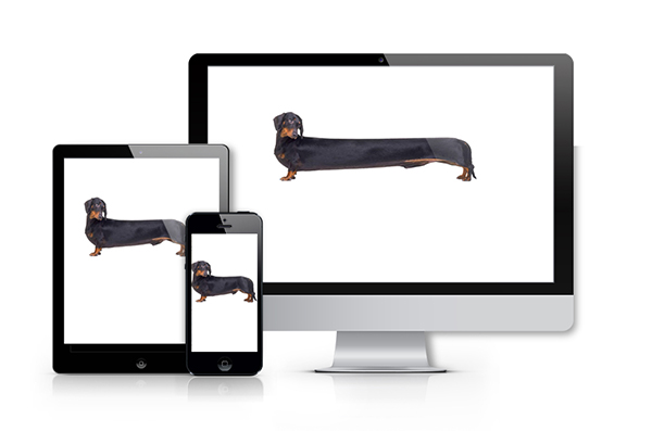
So, what is responsive design exactly? Responsive design is a design adapted to its environment, like it is shown below:
And now let’s see the advantages of a responsive design:

And that is how Mrs. J does it. She pulles out her little iPhone and off she goes shopping. 🙂
By: Lilit Martinrosyan
The comments are closed.
No reviews yet