

Designer Thoughts on Typography Trends
- General
- Industry News
 Oct 21, 2015

 Share
Share 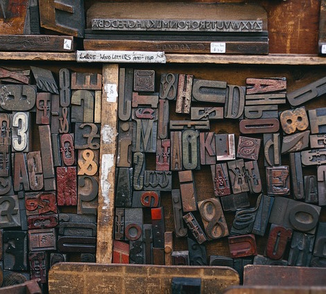 I have been designing consistently for four and a half years and have noticed some major global typography trends in marketing and in the social media world that we live in. We live in a DIY (Do It Yourself) era, where the popularity of handwritten fonts, indie and retro fonts has increased on marketing materials and websites. These font types have a lot to say about the culture we live in. Here are my assumptions on why these font types have consistently been used over the years and are more popular now than ever.
Handwritten Fonts
Before the time of computers, everyone had to use handwriting for great design on marketing pieces. Today, everything is being done through the use of computers, but handwritten fonts bring a familiar personal touch; sometimes bringing up memories, and even emotions. It seems like the world we live in will always be drawn to what is handmade, even if it technically isn’t anymore. The main reason most people decide to use handwritten fonts is because they stand out from regular serif and san serif fonts.
Some designers prefer not to use handwritten fonts. Even though they are unique and convey a different message to the audience, these fonts can be overwhelming. I’ve noticed on websites and graphic design pieces it is best not to use handwritten fonts heavily. Handwritten fonts serve a great decorative purpose, but not always for the corporate world that want to keep designs clean. It can be most effective when used in just certain parts of a design.
I have observed that many wedding invites and letters are sometimes executed using calligraphy fonts. Mainly because the elegant whimsical, curving, calligraphy look provides a modern twist to the design.
Vintage
It’s crazy to think that a font can make someone relate to a certain era, old movie, or century, but Vintage fonts do just that. It’s that simplistic vintage feel that is used to create a unique art piece. Because vintage fonts are so unique, they are very popular in logos and signage design. A large part executing a vintage font correctly is the color chosen to match the message being portrayed.
Retro to Flat?
We live in the bold and brightly colored era where the art deco period is being celebrated again but in a more flat clean outlook on the font front. Not only are more designers utilizing the simplistic outlook on design, but they are also adding in the bright colors and a typeface that complements the color, which still creates a clean design. When I see a successful flat design it is very easy for the reader to read. There are no overbearing decorative fonts, but clean lines and equally weighted lettering. The mixing of one or two fonts is usually used to create a flat design.
Although the typography trends I have examined seem to be a bit contradictory they serve a purpose depending on the audience. These are my own personal assumptions diving into the fact that not only do these trends keep occurring, they seem to be gaining strength.
Ready to Dominate Online and Grow Your Business?
Schedule time to connect with Blueprint about your online goals, or request a free review of marketing campaigns.

Related Posts

The B2B Lead Generation Funnel: From First Touch to Closed Deal

Creating Better and Faster Landing Pages with AI

What Makes a Great Website Design for Healthcare Providers?



Partner with BLUEPRINT to reach your online goals, grow your business and reshape your story.
Get in touch with BLUEPRINT
Reach out to request a discovery call, a free campaign review, or for all other inquiries.