“What can Brown do for you?”
This memorable line is used in ad campaigns by the shipping company UPS to associate their big brown trucks with fast shipping and helpful customer service. It’s a good example of how color palettes do more than fill in a fancy company logo; in some cases they come to represent the company itself.

Most brands use a color palette consisting of just five colors. Think of your favorite sports team.
Notice the color of their uniforms, the posters on the stadium walls, the team pennants you proudly display. I’ll bet that, no matter which sports team you have in mind, you won’t see more than five colors represented in the jerseys, lettering, and team paraphernalia that identifies your team’s brand. The team colors serve as a guideline by which everything else associated with the team is presented to the fans.
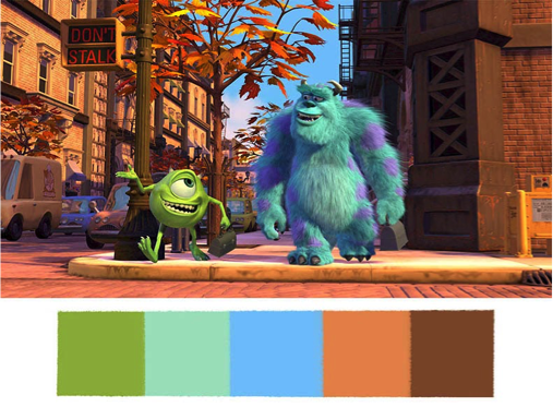
This five-color principle extends beyond graphic design and into other visual mediums such as video. Just as an actor’s body language and facial expressions have a part in telling a story through film, color patterns can be used by filmmakers to evoke certain emotions among their audiences. As Aaron has pointed out, different colors evoke different emotions. We tend to associate the color red for example, with boldness and passion, blue with trustworthiness and security.
In Ridley Scott’s epic film “Gladiator”, a misty blue haze dominates the opening scenes as we are introduced to the heroic protagonist, Maximus. Maximus’s trustworthiness is an essential part of his character, as is the fragility of the security he initially enjoyed as one of Rome’s ablest generals. Gladiator’s opening scenes thus use a color palette that helps to call up these emotions. Other colors are prominent in various scenes where different emotions are appropriate.
Although some films may highlight more than five colors as they tell a story—especially those that are more emotionally complex—a five-color limit seems to be the general rule in film as much as graphic design.

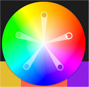
Adobe has created an awesome tool for exploring unique color palettes that all evoke a different response. The brilliance of this tool is that it automatically changes four of the five colors as you change just one. This intuitive-to-use feature ensures that all five colors in your custom palette work well together.
There are plenty of theories and equations that go into creating a feature like this, which we won’t get into, but it sure is cool to see the final product. This webpage is great for creative professionals looking to see how different colors mesh together to create compelling prints. It can also be used by anybody wanting to simply have fun with colors and find out which colors are most visually appealing when paired together.
Color is amazing, and the hues you choose say a lot about you. Give careful thought to what your business or brand is about, and what audiences you are trying reach, and select your colors accordingly.


