“What is the material that our software is made of?”
Take a minute and look around the environment that you are sitting in. Now picture this, everything that you are looking at has been designed. Someone in some room has spent countless hours designing the objects that you are looking at. From the glass screen that you are using to view this post to the pen that you use to write with. Everything is designed.
Google recently asked the question, “How can we make user interaction with our devices better?” Is there an underlying nature that creates the foundation of the objects that we use?
Today, we will look at the future of design and how the world that you live in has shaped the creation of material design.
What is Material Design?
Material design is a system for designing interfaces. A new perspective on what the human and device relationship can be. Material design is a cross platform design language that expands upon the card motif first seen in Google Now, an intelligent personal assistant developed by Google.
In the past, designers have not been thoughtful about the physics behind design. There is a thin millimeter of glass that the user interacts with when accessing their mobile device. Currently, you tap a button to access an application and walah the application opens up allowing the user to connect to the outside world. What if now instead of having to tap an application, the application lift up and meets your finger as the application opens? Google has added a missing layer to the design process, physics.
Physics?
Physics is the physical properties and phenomena of something. All materials have a physical surface and edges. Surfaces and edges provide visual clues that are grounded in our experience of reality. By incorporating shadows and lighting in Google’s material design, depth is created. Shadow and lighting convey how objects interact.
Bold Foundation
The use of typography, grids, color, space, imagery and scale make up the foundational elements of the design process. Everything designed today is encompassing one of more of these elements. Hierarchy, meaning and focus are the results of working with one or more of the foundational elements.
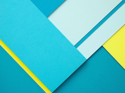
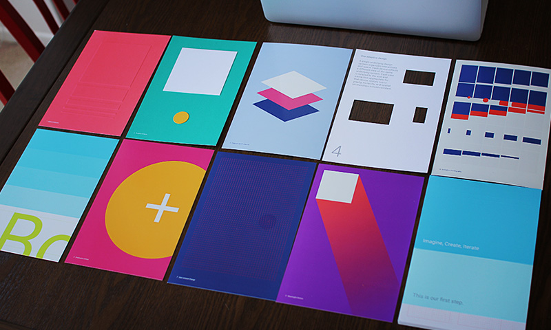
Google’s Material design uses a bold color palette together with muted environments, deep shadows and bright highlights. Google’s color palette for material design can be seen here.
Color Palette
Material design’s color palette is made up of primary and accent colors. Limit your selection of colors by choosing three hues from the primary palette and one accent color from the secondary palette. Learn more about the use of colors in Adam’s post.
Google has suggested over 500 colors that have been hand picked to work harmoniously with each other. Create hierarchy-using contrast to bring attention to important buttons or information.
Fonts
The beauty of material design is that you can use any typeface. However, the recommended font for material design is Roboto. Roboto has been refined extensively to work across multiple platforms. This typeface is slightly rounder and wider providing greater legibility making it more optimistic. Roboto comes in six different weights (thin, light, regular, medium, bold and black). Multiple font weights create hierarchy and contrast allowing the user to be directed to the information that you are trying to convey. Learn more about selecting the right fonts here. Domo arigato.
Floating Action Button (FAB)
Most smart phones today have four or five main buttons on the home screen that allows to user to perform an action. One action may be to make a phone call or send a text to someone. What if 4=1 and you only have to tap on a single button to access any action desired? Introducing… the Floating Action Button aka the FAB.
The FAB can be seen in the bottom right corner of any screen using material design. The FAB comes in two different sizes: default size and mini size. The default size will be used in most cases. The mini size is used to create visual continuity with other screen elements. The FAB represents the primary action in an application.
Building Your Brand
Material design offers a system for designing functional and elegant software. Select a typeface that has multiple weights for your brand and stick to it. Play with scale and hierarchy to best suit your brand’s needs.
Follow the material design guidelines and create a brand that will be able to evolve with the technology that is ever changing in todays fast past society.
Framework or Fad?
The I-pod is one of the most ingenious devices ever to be created. A portable device that in essence made the CD player, 8-track, and many other devices obsolete. One would think that the I-pod was the echelon of designs but a few years later it became obsolete as the I-phone replaced it. Smartphones today encompass many devices that were at one point thought to be unbeatable like the I-pod. There is an application for everything today making other devices obsolete like the I-pod.
Is Google’s material design a framework that will be built upon in future or a fad that will no longer be universal?
What will Apple come up in response to Google’s material design?