The Flat Design Trend
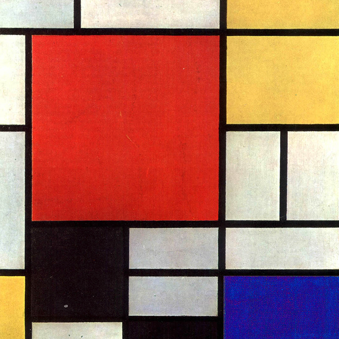
Classic 2D Bauhaus Design
For the past few years, web design has followed various trends. Glossy buttons, gradients and drop shadows are just a few of the fads that have come through the digital design world.
Now, a new trend called flat design is gaining immense popularity with companies such as Microsoft and Apple, who are leading the charge in this movement.
The elements that form flat design add a sense of minimalism to an interface, adding sophistication and user friendliness which are two of the many reasons to consider incorporating this style into your website.
What is Flat Design?
Flat design refers to the simple use of elements like typography and colors. It removes overdone stylistic choices that create the illusion of three-dimensions such as drop shadows, gradients, textures or other tools that are used to add depth.
Returning to the Past?
If you want to create designs with more longevity, then consider a flat design.
In Switzerland during the 1940s and 1950s emerged a design trend called the Swiss Style, which was focused on the use of grids, san-serif fonts and clean hierarchy of content and layout.
The Swiss style can be traced back to the Bauhaus school in 1920’s Germany, which played a very important role in the history of graphic design. Many contemporary designs can be traced back to this origin.
Less is more
Conveying messages without explanation has been a practice since the beginning of time. Cave drawing and hieroglyphics used symbols to convey messages. If a designer has to explain a complicated concept, it most likely failed, which often makes simplicity an ultimate goal in design.
Online, by using icons users are able to reach outcomes faster than when they have to examine a photo. A colon next to a closed parenthesis symbolizing a smiley face is easier to portray than a real smiling face. The user can get lost in the detail of the image and may miss the message that you are trying to convey.
The Elements of Flat Design
Flat design uses strong colors and beautiful typography to convey messages. Colors are a very powerful tool to demonstrate emotion. A blue hue may be used to demonstrate tranquility while a red hue may stimulate a faster heartbeat.
With the implementation of flat design, however, precision has become a must. By removing the “visual fluff” from a site, every error is greatly enhanced and designers can no longer use drop shadows or gradients to hide their mistakes.
Type is Key
Typography is the key foundation of flat design. By removing unnecessary stylistic elements, having good typography is the only way to visually present the content. Fonts are used to exemplify the message of the site. When it comes to selecting the right fonts, the main rule is to make them bold, simple and irresistible. They’re the driving force behind the design, and as much care needs to go into them as the rest of your content.
Application in Real Life
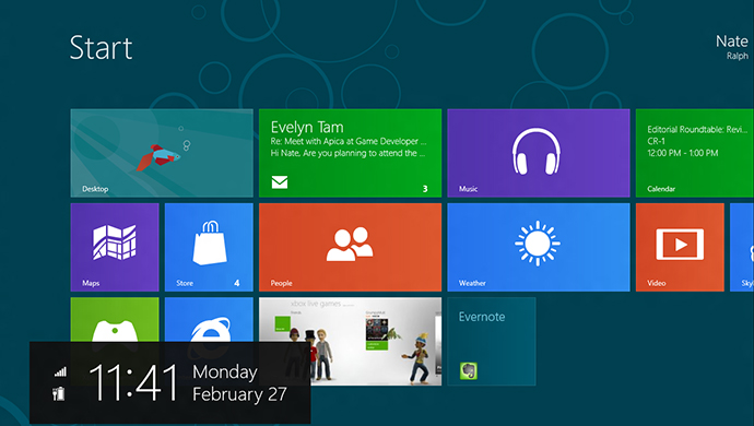
How does Microsoft Metro compare to the early Bauhaus above?
Microsoft and Apple have adapted to the flat design trend.
Microsoft incorporated flat design into their Windows 8 interface. There are many applications designed by Apple that use a flat design to easily convey messages. By using bold colors and typography, these interfaces look cleaner than their three dimensional contemporaries. Yet they harness a world of design that is almost 100 years old.
The flat design trend might not be the universal answer for design, but it is the style that will define this part of history.
With designers using this trend to focus on the necessary and needed elements, it has given a greater stress on attention to detail and with creating dynamic content to attract users rather than flashy visuals. Plus, with messages being conveyed faster though the use of flat designs, providing this content quickly and efficiently should become a top priority for any successful brand.