How To Select The Right Fonts For Your Website
 Selecting a font can be a frustrating task. There are endless options and you can get lost trying to find the best typeface that demonstrates the mood you are trying to portray.
While there are no easy-to-follow rules on how to select the best font, there are many principles that can help you choose an appropriate solution.
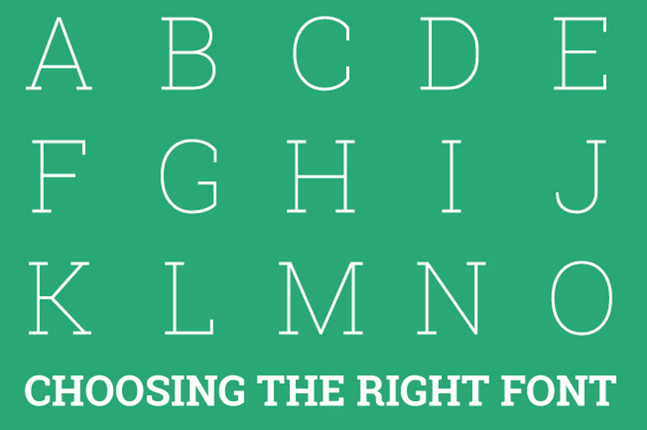
In the world of fonts, there are serif and sans serif fonts.
What is a Serif?
A serif is a type of font that includes a tail at the tops and bottoms of a letter. Serif fonts are viewed as more formal and traditional. Common serif fonts include Times New Roman, Courier and Palatino, which can be found on all computers.
Serif fonts are more readable than sans serifs. This is why many educators require papers to be written in Times New Roman. Studies have shown faster reading speeds and greater comprehension when reading a serif font.
A sans serif font is a font without a tail. Sans serif fonts are viewed as informal and playful. Common sans serif fonts include Helvetica, Arial and Futura. Sans serif fonts are more difficult to read.
For this reason, they are used most often for short text sections such as headlines or captions.
Font Sizes Create a Mood:
The size of your font affects the tone and meaning that you are trying to convey.
Large fonts may portray insecurity, suggesting that the author needs to fill up space. Smaller fonts are more successful for powerful messages.
Another factor that you need to consider is whether the use of multiple fonts can enhance a site. One tactic is to choose two fonts that contrast. Two fonts that are clearly different can create tension or bring energy to a page.
If the two fonts are too similar, the overall message of the page can get hidden. Using one serif and one sans serif font is a good principle to achieve balance on your website.
Do’s and Don’ts of Selecting Fonts:
 The fonts we select have an impact on our readers.
Here are some do’s and don’ts of selecting fonts:
- Do choose a font that is legible and easy to read.
- Don’t use too many fonts. Fonts have font families that can convey a wide range of emotions. Fonts can be regular, italic, semibold, bold, black, round or several other combinations thereof. A good typographer will be able to create emotion by using only one font.
- Do be mindful of line spacing. Lines that are close together can appear crowded and hard to read. Lines that are wide apart appear lighter and opened. Wider lines may also appear empty as if trying to take up space.
- Don’t use fonts like Papyrus or Comic Sans. There are many other options that can and will serve you better than a cache font. These fonts will irritate a designer, making he or she less inclined to working with you on any further projects.
Chose Wisely:
There is not one perfect font for your project, but there can be a great combination. Serif and sans serif fonts can work in harmony on your site. Sans serif fonts are best for headlines and serif fonts a good choice for long body paragraphs, as they are easier to read.
Be mindful of the font size that you use. Too large may appear incompetent or demanding while too small may lose legibility.
Stay away from fonts like Papyrus and Comic Sans. Be mindful of your users and, when in doubt, choose a font that can be read easily.
Now you are able to choose an appropriate font.
Free Font Websites:
Here are some websites that I recommend if you are looking for new fonts.
- Font Squirrel: This site has a great directory of free font families.
- DaFont.com: This site contains a lot of fonts that are great for headlines. However, be careful of the spacing between the characters in each font. There are many bad fonts on this site that need kerning, the space between each character.